


Branding is important in almost every industry, from technological, to the music industry, acting, and even sports. Sports teams are particularly known for having great brands, at least the more successful teams. Even the less successful teams that have a good following, must have done something right in the past, in other words, they must have built a good name for themselves.
For some sports teams, not everything is about the results, even though winning keeps the fans happier. Having a good brand is more important, because that is among other things, what attracts people. Logos are an important part of every brand.
The Philadelphia Flyers have an interesting logo, some would argue might not be the best design. The best way to look at a logo is compared to other logos, but firstly, we would need to examine the flyers’ logo in detail.
The Philadelphia Flyers Logo – Explained in Detail
During the founding years of the Philadelphia Flyers, back in 1966, not every detail was covered. When a team is being founded, everything has to be designed. Bill Putnam, one of the members selected by the NHL to form a Philadelphia team, organized a contest to design the team’s colors, as well as a logo and arena. The colors were, as we know, black, orange and white. Putnam chose the colors because they had meaning to him.
The team’s name came from Ed Snider’s sister, Phyllis, who came up with the idea of Flyers. Snider considered the name to be a great idea, because it sounded good and because it sounded good with Philadelphia next to it. It was a phonetic match in heaven.
The logo was designed by Mel Richmann Inc. a design company.
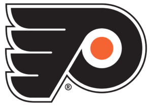
The project was headed by Tom Paul, but the logo was designed by Sam Ciccone. Broken down, the logo has a letter P, with an orange puck inside it, to represent hockey.
There are four wings attached to the letter P, symbolising the name Flyers, as well as the fact that hockey is a speedy game.
From a design perspective, the logo makes a lot of sense and is very sound.
The Flyers’ Logo Compared to Other Teams Logos
The Flyers’ logo might look out of place but when you compare it to some of the other logos, it makes perfect sense. For example, the Calgary Flames has a flaming C, which is very straightforward, even too much so. The Buffalo Sabers has a Buffalo and two sabers on the logo, which again, is very straightforward, much more so than the Flyers’ logo.

The Minnesota Wild, on the other hand, is a logo of a wild animal, and inside the animal is a forest and sunset, with the animal’s eye being the North Star.
This logo has too much information for most people to decipher immediately.
The Anaheim Ducks have a logo in the shape of a letter D, but one would assume the logo to be designed by the same person who designed Batman’s batarangs. It is another example of a relatively complex logo which does not give the observer much to go on.
All in all, the Philadelphia Flyers have a pretty decent logo. The P stands for Philadelphia and the four wings stand for Flyers, while the orange dot is an ice hockey puck. The logo makes a lot of sense.